
Check back soon
Once posts are published, you’ll see them here.


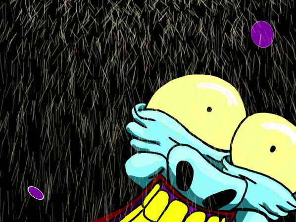


Following on from the previous blog, I said was studying the colours of Urbance for the electrifying energy that it has because I have a thought that these kind of bright, artificial colours could work really well with my highly emotional characters that I want to make.


All these studies above I've taken from stills of the animation pilot episode. This face that I drew allowed me to see how and where exactly each colour could go to bring the character alive. Each colour combination has the potential to represent a different mood whether it be triggered by the facial expression or not. One thing I got to grips with a lot more by studying this colour scheme is tone. Understanding how each colour works with each other more harmoniously when they are all hover around the same tonal value. Some colours better than other obviously. Making a colour clash in one of the examples above where we have the blue against the red gives a subtle glow around the face if you hit the sweet spot in the difference between the two colours. I think that's what I love the most about looking at this colour scheme.


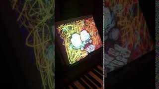
These colour combinations were as a result of studying the ones from above. I continued to play the the tonal values and colour contrasts on Photoshop to see what else I could do. I explored both colours that clashed and ones that worked together all the while keeping in mind how these colours could work with the expressions I want to make.