
Check back soon
Once posts are published, you’ll see them here.


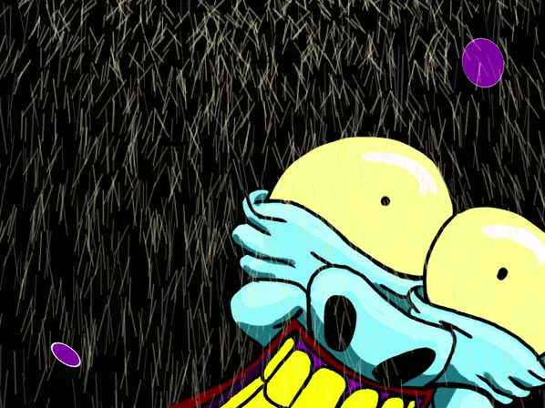


These are my experiments from all the playing around I did on Photoshop to try and see if I can reflect the mood and emotion of the character in the moment that he's in without drastically changing the colours of the character itself.

In this example I kept the same colour scheme as I chose in the previous blog and I enhanced the exposure of the frame using the adjustment settings. The white in the character's eyes went yellower, his flesh tone and lips more saturated and overall, as the feature suggests, a more enhanced image. I believed that this could potentially work when the character turns his emotions into something more powerful from the blank state that he first appears in.
Much of this experimentation I'm doing here was inspired by the colours in Urbance because those neon colours in the animation would've had that exposure and saturation blown up for effect.

Here I went a step further and took the image from the one above and did some more to it by bringing up the tonal value of the frame through the curves and levels feature. Again this made the whole thing even more saturated and brighter than before. I felt that I could definitely use this for when the character becomes ecstatically happy. The bright, bright blues ad reds will be really over-the-top and in-your-face when its finally complete which again will reflect perfect the entire theme of the film.

With this colour range I kept the settings from the one above this image and brought down the brightness and saturation again through the curves and levels feature but also through toning it down through the exposure and brightness settings. This will look perfect for when the character becomes sad and is about to cry. Somehow I'll need to find ways to be able to gradually transform the colours into what I want them to be at the correct moments in the film.